Printer's Guidebook, Part VII

Ink

Yes, you've seen this Richard Greaves image before. It is still, he says, the best way to convey the concept of pigment-particle size and shape.

22. Pigment grind
Ink manufacturers grind the pigment to reduce it from a collective mass to unattached particles.
  jelly beans photo

Think of a single particle of pigment as a single snowflake. What the ink manufacturer starts with is more like a snowball, composed of millions of individual flakes compressed together. The grind reduces those collective pigment particles-from either an agglomerate (particles randomly attached to each other) or an aggregate (particles attached side by side)-with the goal being to attain unattached particles of pigment in the snowflake range.

The scale for gauging grind is from zero to eight (or higher), eight being the finest grind typically available, and most appropriate for garment-printing requirements. As far as determining the grind of a given ink, the problem is that the industry-standard test is dependent on viscosity. If one has a certain viscosity pigment dispersion with a grind of seven, for example, and reduces that viscosity, it may well be transformed to a grind of eight. Unfortunately, manufacturers do not correlate between viscosity and grind.

The other important physical characteristic of the pigment is its aspect ratio or shape. Aspect ratio means the length vs the width of a particle of pigment, expressed as a ratio. Blue inks, for example, tend to have needle-like, relatively large particles. At the other extreme are white inks, wherein pigment particles tend to be almost perfectly spherical and extremely small. So the blues tend to be very thixotropic, meaning that it takes less energy to thin them, and longer for them to recover. Look at it this way. Let's assume you scatter a handful of toothpicks. The more you scatter them, the longer it's going to take you to restructure them, to gather them up into the uniform handful in which they started. Whereas, if you scatter marbles, you simply scoop them up and they're more or less automatically restructured.

Information on pigment grind is typically available from the manufacturer. If the grind is not eight (or higher) at the viscosity that is supplied, the user should be skeptical. At lower grinds, the pigment is not adequately dispersed (see Variable 23: PIGMENT DISPERSAL), and the dispersion will take place in the screen. You'll see color streaks, inconsistent color (particularly with transparent inks) and a major change in printing characteristics, over the course of the press run.

White inks, because their pigment particles are spherical, tend to be very dilatant (expanding), or "shear thickening." As you apply shear to them (either while mixing or with the squeegee blade), the nature of those white pigments sets up resistance to the shear. Put simply, the shape of the pigment particles greatly influences the ink's reaction to the force that is applied to it. Thus, white, even if it's a grind of eight, will typically force you to print more slowly. If you try to print too fast, it will build up resistance and won't want to transfer through the screen. It literally gets thicker.
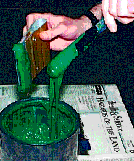
23. Pigment dispersal
The extent-in terms of both concentration and dispersion-to which pigment is mixed into the medium.
 
Consider a powdered pigment that has been dispersed in a vehicle or a solvent compatible with the ink you are using. Since we're dealing with T-shirts, and the majority of them are printed with plastisol, the vehicle or solvent for dispersing pigments will be plasticizer.

Pigments have two properties, among others, that relate, in terms of color, to dispersal. One is mass-tone, the other is under-tone. If you look into the container of what will be a beautiful cherry-red ink when printed, it might look a dull, maroon color. That's because you're seeing the

pigment's mass-tone. If you look at ink in its container, even though the pigments are inherently transparent (except for white), what you're seeing is light refracted to such an extent that you can no longer see through to the background; you no longer get light reflected from that background. The color, in other words, is determined by how it is going to look in a thinner ink deposit, rather than in the can. This is an important distinction because, paradoxically, if you over-disperse (or overload) a pigment into the ink, you risk going from its under-tone-generally high-chroma, very pure, very saturated-to its mass-tone-much lower chroma, not nearly as pure.

It looks as if you've added black to the dispersion.

Finally, and a characteristic of any ink, over-pigmentation can degrade abrasion resistance and washfastness (which is why crock testing is so important, particularly when water-based inks are used).

24. Viscosity
Those ink characteristics that make it more or less resistant to flow.
 
Viscosity is a form of drag. If you drag your feet on the ground, it will take more force to push you, even if you're on a bike. Viscosity describes internal drag or friction-in other words, resistance to flow. The greater the internal friction the greater force required to get the ink to flow. Pigments, solvents and temperature are only some of the differences that can alter viscosity. High-opacity inks are very viscous, because of large pigment particles that are hard to stir. Blues and blacks, because their pigments are lightweight, needlelike and large, tend to flow more easily. (Neither of these extremes is necessarily desirable.)

Viscosity is extremely temperature dependent. At eight o'clock on a winter morning in Vermont, versus four p.m in L.A, the viscosity of identical inks will be different.

Viscosity varies from high (stiff, resistant, hard to stir) to low (thin, even runny). The simplest measurement of viscosity is watching ink drip off the end of a stirring knife and judging whether the drip of ink is "long" or "short." Short is best for screen-printing.

It is also important to note the shear conditions when you measure viscosity. Viscosity can change depending on what forces are acting on the ink. Any force that causes an ink to flow is called shear (see Variable 25: FLOW CHARACTERISTICS). Ink sitting in the bucket is at lowest shear because there is no force acting on it. Hand stirring is low shear (low force). Printing with a squeegee blade is high shear especially when you have a fast stroke speed. Most printing ink's viscosity will go down when stirred or printed. This is called "shear-thinning"; most will return to their higher viscosity after a period of "recovery."

Viscosity and its changes are easier to measure than the complicated interconnected properties that affect it, so it is commonly used to check manufacturing consistency.

Instruments that measure resistance by adding shear are called viscometers and they come in many different types. The most popular is the Brookfield spindle viscometer which spins a shaft in the ink at a know speed and measures the resistance. These are very low-shear viscometers and don't simulate as much shear as that provided by a squeegee blade. A Severs rheometer will be more representative of the shear levels applied by the printing blade, and will serve better to predict how the ink is going to perform on press.

Pigment grind, pigment particle properties and pigment dispersal have a massive affect on viscosity and we have no control over them. If you check viscosity and temperature upon receipt of ink, before the run and during the run, you will be able to predict if an ink will perform to your specifications, rather than waiting for results from the press. This will save you time and thus money.

25. Flow characteristics
Those properties of a plastisol ink that describe (and determine) its "shortness ratio."
 
An ink's behavior when printed is known as its flow characteristics. All inks have personalities that become evident when we print them. An ink's resistance to flow (see Variable 24: VISCOSITY, above) is probably the easiest to see. Most printing inks' viscosity changes, depending on the forces applied to them-this describes their personalities and the printing result.

ink flow demonstrationAn ink's "shortness" is revealed by the way in strings out (or not) from an ink knife or squeegee blade.

Any force that causes an ink to flow is called shear. Ink sitting in the bucket is under a no-shear condition, because there is no force acting on it. The textbook name for "no shear" is relative viscosity. Hand stirring provides low shear (low force). Printing with a squeegee blade is high shear (textbook name: plastic viscosity), especially when you employ a fast stroke speed.

These relative flow characteristics are typically referred to in terms of the ink's "shortness ratio"-the relationship or distance between the point at which an ink leaves its relative viscosity and the lowest point of its plastic viscosity.

Consider that if you took a dab of plastisol between your thumb and index finger, then quickly snapped them apart, a "long" ink would tend to string out, while a "short" ink would break off cleanly. The "longer" an ink is, the longer it will string.

The best printing ink has high relative viscosity and extremely low plastic viscosity-as soon as you push it with a blade, it easily flows through the mesh.

As with viscosity, flow characteristics are extremely temperature dependent-a matter both of climate and of friction. Since temperature is not easy to control, it is normal to alter flow with viscosity reducers (to increase flow) or thickeners (to increase viscosity).

The printer's appreciation of or desire for a particular shortness ratio will be predicated by printing parameters such as the amount of hydraulic force applied, screen tension, blade size, stroke speed, off-contact distance and so forth, all versus the geometry of the mesh and the stencil, in terms of both thickness and open area.

If, for example, you're attempting to print with a short ink through a thick mesh with a very small opening, you'll have difficulty transferring the ink. Even though a shorter ink is generally a better way to go, you may need an ink that does not recover (return to its relative viscosity) rapidly, in order to properly transfer it through your screen mesh.

26. Tack
A factor in the amount of hydraulic pressure required to push ink through a stencil, as well as its rate of pick-up on successive screens.
 
Tack means surface stickiness to touch. The attraction between the surfaces of unlike substances is called adhesion, while attraction between like substances is called cohesion. When an ink wets a surface (ink and shirt or ink and screen) the adhesion is more powerful than the cohesion of the ink to itself. This is shown by the fact that the ink adheres to shirt and screen when the two are separated. Textile screen printing needs tack to get the ink to transfer through the mesh but, because we print wet-on-wet, the ink also adheres to subsequent screens.

Generally an ink with low cohesion is a short ink and perfect for screen printing. Unfortunately, the more pigment we add the tackier it gets. Many of the starch- or talcum-like fillers and extenders of high opacity inks are also very sticky when mixed with plasticizers. This is why high-opacity inks that are designed to print on the surface of a fabric (not penetrate like wet-on-wet inks) have to be flashed (gelled with heat) before the next screen crushes them and they stick to its bottom. Tack is also a factor in the amount of hydraulic force required to transfer the ink through a given fabric and stencil. This is because its tack level regulates to what extent the ink sticks to the mesh threads and stencil tunnels.

Excessive tack in a plastisol may indicate that the grind of the pigments-and particularly the grind of the base-was inadequate. A plastisol ink has two phases: its liquid phase (plasticizers, surfactants, additives, stabilizers and so on) and its non-liquid phase (primarily, resin and pigment). Excessive tack is an indication that these phases are not interacting or designed properly. Improper processing, improper mixing procedures and inappropriate choice of ingredients and modifiers cause the ink to develop a higher tack than was initially intended.


Next - More Ink


Thanks for stopping by!

1997 National Business Media, Inc.